RENTS is a sustainable car rental service that puts the mission of protecting the environment as our top priority
“ How can we convey more transparency and security in the car rental booking process, while maintaining a quick and seamless flow? ”
Let’s face it - booking a car is not the most pleasant task. Based on the research that I preformed, people demand to know how much and for what they’re paying, with no surprises at any part of the booking process, and they want it fast and smooth as possible so they can compare it with other car rental service providers or just get it over with.
RENTS is an online car rental booking service that, through their website, aim to eliminate any unnecessary noises in the booking flow while being honest and transparent as possible throughout it.
Providing clear CTAs, clean streamlined design and humanising the process as much as possible - is how I wished to achieve it.
16 Weeks
20+ Screens
• Competitive benchmark
• Online survey
• Note-taking
• Usability test
• Affinity Diagram
• Customer Journey Map
• Flow Diagram
• Interaction Sketches
• Prototype
•Annotations


Competitive benchmarking analysis seeks to understand your brand’s success (or lack of it) against others within your industry
-
I aim to see which parts are working, to be inspired by them, or what’s not working, that I can avoid.
-
Each comment and slide will be accompanied by photos and videos so that I can review and come back to them.
-
At the end of each site/app there be a sum-up marking my impressions, instead of reading the whole thing again.
-
I focus on the rental process , starting at the homepage all the way to the checkout.
-
Screenshot every interaction that I preformed in each screen and screen state
-
Using Apple’s “Keynote” I added and mapped annotations that I thought worth mentioning.
-
Categorise each annotation: 🟢 Success vs. 🔴 Roadblocks and Pain-Points.


• There are repetitive features and actions that are basic and are a must-have such as: search box (and what it entails), car selection, insurance plans, a linear booking process which leads finally to a payment page.
• Looking from a user perspective, there were some roadblocks that I experienced along the rental process:
- Some terminology was unclear.
- Sales offers that are not relevant to me
- In some case - too many screens.
These point should be taken into account while working on my design.
• As contrast to the last comment, the positive features such as the location finder and fewer screens (in one brand in particular), as well as a calm and clear design, should be adopted in my design

Example from the competitive benchmarking from other car rental services. Each annotation was categorised and was directly attached to the screenshot taken from their Website.
Click below to download the complete report from the competitive Benchmarking

Rents
UX Case Study
-
I want to learn about the user experience with the car rental service.
-
I want to learn from their habits and behaviours so I can implement it in my design.
-
I want to see which pain points they endured, so I can avoid them in my design.
-
I want to spot any patterns from the answers of the participants.
-
Distribution: Linkedin, WhatsApp
-
Survey Tool: Google Forms
-
Participants: 25
-
Number of Questions: 9
-
Time to Complete: 3-5 Minutes
-
Survey Duration: 6 days
• There are repetitive features and actions that are basic and are a must-have such as: search box (and what it entails), car selection, insurance plans, a linear booking process which leads finally to a payment page.
• Looking from a user perspective, there were some roadblocks that I experienced along the rental process:
- Some terminology was unclear.
- Sales offers that are not relevant to me
- In some case - too many screens.
These point should be taken into account while working on my design.
• As contrast to the last comment, the positive features such as the location finder and fewer screens (in one brand in particular), as well as a calm and clear design, should be adopted in my design
Full Transparency on what's included in the price of the car, and a clear detail of the costs per day and per trip.
Click below to download the complete report from the competitive Benchmarking


How often do you use a car rental service?
Very frequently (Once a Month)
Frequently (1-3 Months)
Quite Rarely (Every 3-6 Months)
Rarely (Maybe once a year)
Are there any specific features that you appreciate from a car rental service? (you can mark more then one feature)
For which purposes were you using the car rental services? (You can mark more then one option. If other, then point please which)
What would you expect from a rental service? which improvements would you make?

Transparency when it comes to insurance, User friendly interface
Early Deposite Blockage, automatic pick up, drop off
Fair prices
Easy online process when booking.
Cleanliness, vehicle condition, flexibility in return hours, vehicle replacement and repair service.
-
Similar to the Note-taking method, my main goal is to hear first hand from the user how he approached the task; which roadblocks he faced; what pleased him in each website, etc.
-
Every interview that I hear and conduct on my own is another way to practice the most important skills in UX Design - User Interview.
-
Software: “Lookback” and “Adobe Premier”.
-
Equipment: Microphone, Screen-recorder app (Lookback), Front Camera.
-
Transcript: Using “Adobe Premier” I added subtitles to the video to make up for some unclear audio segments.
-
Duration: 2.5 Hours, which condensed into 1.5 Hours.
-
Participants: 1
• Conducting the Usability Test myself, which started at the prep phase all the way to transcribing it, was an amazing experience and allowed me to watch Julian confront 2 websites almost on his own, and hearing his pain points and successes.
• There is a lot that I can improve on my end, especially the silent parts where I felt that I didn’t know how to react, and also learning to improvise and pivot the Interview.
• Again and again you see the urgency in need of transparency and having a clear and smooth booking flow.
Clear CTA, Clear Symbols (Icons) with added description and easy language
Click on the icon below to view the complete User Interview in Google Drive.

For this usability test I used the help of my friend, Julian, to assist me in practising my interviewing skills and, above all, to gather insights from him regarding his live experience from a car rental website.
Usability Test - seeing live how Julian see and interact with the search terms and design on his own laptop.
Talks about the fees in the Car Selection Page (Avis)
Talks about the car images in the Car Selection page
Needs a visually clear progress bar to indicate where he is and wha's to come
Wants to switch the language on the Homepage
Talks about the a sale banner on the Homepage (Europcar)
Talks about icons in the Car Selection page
Choosing the date in the Homepage for the car Pick-up
When switching through screens on the homepage, the information that was inputed, gets lost


360º view of the car, allowing to have a more precise look of the vehicle before renting it.
-
The purpose of note-taking is to extract the key information from a usability test or interview.
-
I would use the note-taking method to gather up as much information as possible from real users who will be testing car rental websites.
-
This information will later help me focus on which requirements does the user has, while renting a car online.
-
I used the “Pages” word processor app on my iPad, in order to document any thoughts, feelings and behaviours that the users projected.
-
I used icon and Color codes to different between general comments, positive feedback or successful action, and pain points.
-
I marked every time he user moved to another screen and I time coded each comments.
-
On top, I added direct quotes to support my findings.
• Both users showed signs that the first site, SIXT, was more intuitive and straightforward, compared to the second website.
The navigation felt easier to them and the filtering options which allowed the task to be completed with less effort.
• The second, gathered from the two users, was more confusing. The filtering options were not as intuitive, The overall design of the site weren’t as slick and appealing and the homepage was very loud and not as organised and the first.
Kate, the 2nd user even mentioned that she would probably consult with a friend, or another site before making her decision.
• Some of the terminology was difficult to understand.
Clear CTA and a clear path showing where the user is, where they were and what's to come
Click below to download the complete document with all the annotations

The Note-taking method helped me to gathered all the insights that I deemed important to my research.
The interviews were not conducted by me, but they both test car rental services from actual people.
I gathered a lot of insights, on top of the interview (later on) that I conducted on my own.


Example #1 : Every Note was categorised and marked.
Example #2 : Every experience was marked and annotated.
The user to be not so decisive with the terminology of the CTA
Information overload regarding the insurance plans
Confusing Terminology
The user has confused one page with another
The user has complained that the Homepage was busy


The Affinity Diagram is a result of the research that I conducted using the different research methods: Note-taking, Online Survey, User Testing and Competitive Behmarking.
-
Gathering and making sense of all the information gathered from the research.
-
Finding occurring patterns that will serve as solutions or inspirations.
-
Tools: “Miro” , Sticky Notes & Sharpies.
-
Duration: 2 weeks
-
Team: 1 member.
• Turning the mass of information into “easy to chew” bits.
• Extracting actionable options for solutions to the users’ pain points and understanding the conventions that actually work.
• Takes quite a long time, but at the end I got the chance to see how all that prior research that I did paid off and what I can learn from it.
Click on the icon below to view the complete board on "Miro"
-
Dismantling each step that user makes, in order to understand where and how it can be improved.
-
As a visual learner, it is easier for me to relate and understand the emotional and circumstantial states that the user is in.
-
Depicting from the research the user’s:
- Goals
- Behaviours
- Context (of use)
- Pain Points -
- Experience.
-
Tool(s): “Miro”.
-
Duration: 1 weeks.
-
Team: 1 member.
• Putting myself in the “user’s shoes” cemented the idea that I am designing for someone else and not myself.
• Dismantling each step of the booking process allows me to make chunks of the whole bank of information and, later on, easier to design.
Click on the icon below to view the complete board on "Miro"
The Customer Journey allowed me to envision the process that the user does in order to complete his/her task of booking a rental car. The journey was based on the prior research that I conducted.
Overall view of the customer journey. Dividing each step in the car rental process and trying, based on informed guesses, to visualise the emotional state of the user, the context, behaviours, and goals.


A flow chart is a diagram that depicts a process, system or computer algorithm. They are widely used in multiple fields to document, study, plan, improve and communicate often complex processes in clear, easy-to-understand diagrams.
In this flow chart I showed the different screens and actions that the user will take in order to achieve her goal of renting a car.
-
Understanding and visualising the booking process through the different screens.
-
Understanding the different states in each screen.
-
Step 1: Sketch the process to allow changes and debate
-
Step 2: transferring the information to a "Miro" and organising it by color and steps (Screens).
-
Tool(s): "Procreate" & “Miro”.
-
Duration: 1 week(s).
-
Team: 1 member.
• Setting the ground for the Wireframes.
• Understanding which decision leads into which action which would lead to which screen / screen state.
• Having a guiding map to refer to it in the design phase.
Click on the icon below to view the complete board on "Miro"

An overall view of the flow that user goes through in order to achieve her goal.
-
Sketching are non restrictive and they will allow me to start visualising how I want the booking process to look.
-
Beginning to make sense of the screens and see how the user interact with each screen/state.
-
Sketching the process on my iPad and adding annotations, mostly to myself, and instructions on how to use each Screen & Screen state.
-
Tool(s): "Procreate" & “Miro”.
-
Duration: 1 week(s).
-
Team: 1 member.
Click on the icon below to view the complete board on "Miro"
During the sketching part of the design process, I wanted to visualise the steps that the user takes in order to finalise his/her rental process. I used annotations in order to explain, mostly to myself, what led me to make that decision or what I should take notice of.
Examples of the screens I sketched, showing what happens when the user starts a booking process all the way to the end.

Medium Fidelity Prototype for me is a way to add interactivity to the flat Design and basically mimic how the website will act.
It's a way to remove any design elements and just focus on the User Experience and the User Flow through the car rental booking process.
-
Understanding how the user moves through the booking process, based on the research that I conducted.
-
Adding interactivity in order to test the fluidity of the flow and how the user achieves her goal.
-
Using Figma, I sketched the stripped version of the user flow and added interactions from the first screen all the to the confirmation page.
-
Tool(s): "Figma".
-
Duration: 2-3 week(s).
-
Team: 1 member.
• Adding interactivity to an unpolished version of my design allows me to test the flow of the booking process and to spot any obstacles along the way, which I can avoid later on in the Hi-Fi Prototype.
• Visualising each screen and screen state will allow me to showcase my design intentions more clearly to the stakeholders and the developers team.
Click on the icon below to view the complete board on "Figma"
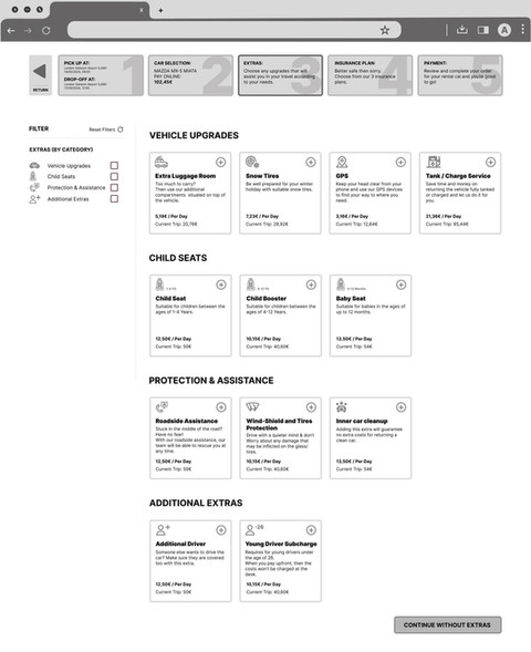
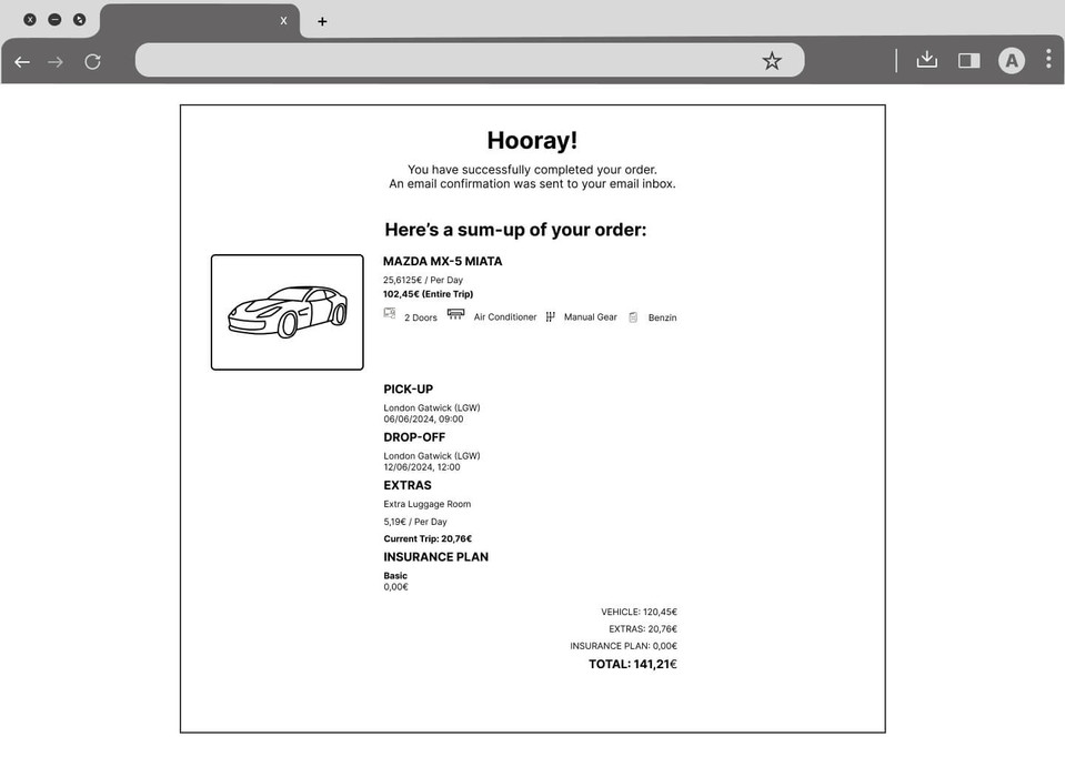
Example the screens I sketched, showing what happens when the user starts a booking process all the way to the end.
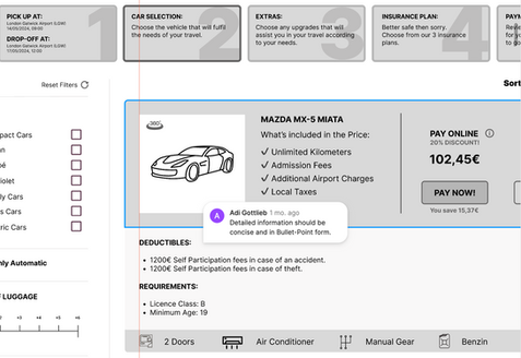
-
Adding each annotation to how the screen / screen state will react to the users' actions will allow the development team to understand exactly what I mean in my design and will reduce confusion.
-
Build a solid foundation with the development team.
-
Using Figma, I used the "Comment" function and add annotations to the Hot-Spots that should be interactive or that are important to emphasize.
-
Tool(s): "Figma".
-
Duration: 1-2 week(s).
-
Team: 1 member.
Click on the icon below to view the complete board on "Miro"
The annotations are the basically the first contact with the development team regarding the start of technically working to give life to the software.
Examples of the screens I sketched, showing what happens when the user starts a booking process all the way to the end.
• Each annotation that I’ve made is in close relation to where and what should be done.
I used clear and short sentences, in order to not confuse too much and also allow a place for creativity and to avoid any strictness about a specific action or design that I need to be made.
• Some screens are repeating themselves in different states, the annotation for each screen is valid to the rest of the screens which are in the other states.
Testing the Mid-Fi Prototype Design with actual users.
Based on the outcome of the usability test, produce an High Fidelity Prototype.
Reiterating the design process and making changes according to the outcome of the usability test.
Producing the UI Kit and sharing all the screens from "Figma" with the development team.
-
Homepage > Search-Box:
-
From: Type 'Ber' (Berlin Brandenburg Airport)
-
To: Type 'Col' (Cologne-Bonn Airport)
-
Date: From the 4th of May till the 7th of May
-
Time: Start 08:00. End 16:00.
-
Car Selection: First "Car Card"
-
Insurance Plan: Basic
-
Extras: "Extra Luggage Room"
-
Payment:
Jane Doe (Capital J and Capital D)
jane@doe.com
Somewhere Street (Capital S) 155
Sometown
Germany
To test the product properly, give the following search criteria:


